Tooltip Component | Godot
A downloadable project
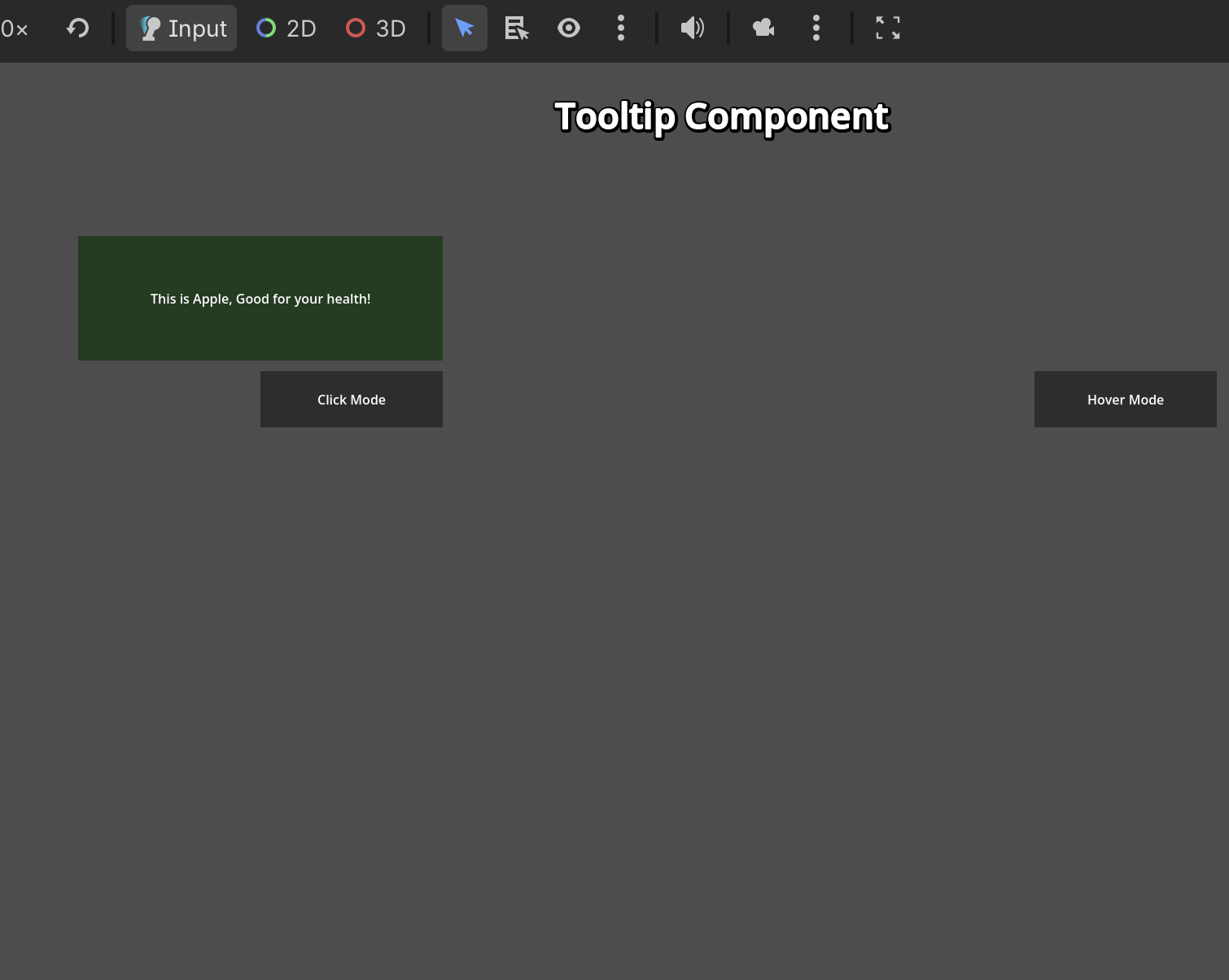
Tooltip Component Guide
A highly customizable, easy-to-use tooltip component for Godot 4.6+. Attach it to any Control node to display helpful information with juicy intro/outro animations. It fully supports both Hover-to-Show and Click-to-Toggle modes.
You can customize everything you want.
✨ Core Features
- Two Display Modes: Choose between hovering over an element (like an info icon) or clicking an element to show the tooltip.
- Juicy Animations: Built-in scale tweens with overshoot for both opening and closing the tooltip.
- Auto-Assign Nodes: Automatically detects its parent as the target node if not explicitly assigned.
- Click-Outside to Close: In Click mode, clicking anywhere outside the target and the tooltip itself automatically closes it safely.
- Hover Delay: Built-in customizable delay (debounce) for Hover mode, preventing the tooltip from flickering when the mouse just passes by quickly.
Github: https://github.com/NgocHai220998/Godot-Sample/tree/main/GUI/components/tooltip_c...
Download
Leave a comment
Log in with itch.io to leave a comment.